Understanding Graphic Design Terminology Made Easy
- GARETH WRIGHT DESIGN

- Nov 5, 2025
- 5 min read
Graphic design is a powerful tool for any business looking to stand out. But if you’re new to the world of design, the terminology can feel like a foreign language. Don’t worry - I’m here to break it down for you in a way that’s simple, clear, and even a bit fun. Whether you’re working with a designer or trying to understand what makes a great logo or brochure, knowing the basics will help you make smarter decisions and get better results.
Let’s dive into some key terms and concepts that will make graphic design less mysterious and more accessible.
Why Knowing Design Terminology Explained Matters
When you understand design terminology explained, you gain confidence. You can communicate your ideas clearly and avoid misunderstandings. For example, if you want a logo that’s “minimalist” or a brochure with a “grid layout,” knowing what those terms mean helps you describe your vision accurately.
Plus, it saves time and money. Instead of going back and forth with vague feedback, you can give precise instructions. This means your designer can deliver exactly what you want faster.
Here are some essential terms you’ll encounter often:
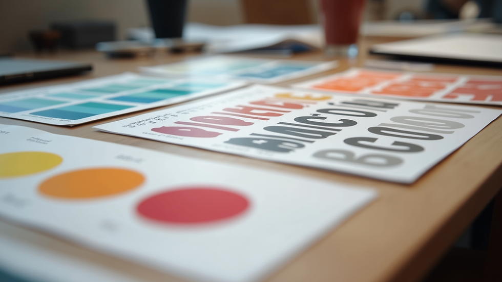
Typography: This is all about fonts and how text looks. It includes font style, size, spacing, and alignment.
Colour Palette: The set of colours used in your design. Colours evoke emotions and create brand recognition.
Layout: How elements like text and images are arranged on a page or screen.
Resolution: The quality of an image, usually measured in pixels per inch (PPI). Higher resolution means sharper images.
Vector vs Raster: Vector graphics use shapes and lines, so they can be resized without losing quality. Raster images are made of pixels and can get blurry if enlarged too much.
Understanding these basics will help you navigate any design project with ease.
Breaking Down Design Terminology Explained for Everyday Use
Let’s get into some more detailed terms that often confuse people but are really straightforward once you know them.
Typography Terms
Serif vs Sans Serif: Serif fonts have little “feet” or strokes at the ends of letters (think Times New Roman). Sans serif fonts don’t have these strokes and look cleaner (like Arial). Serif fonts are often used for print, while sans serif is popular online.
Kerning: The space between individual letters. Adjusting kerning can make text easier to read or give it a unique style.
Leading: The vertical space between lines of text. Proper leading improves readability.
Tracking: The overall spacing between letters in a block of text.
Colour Terms
Hue: The pure colour itself, like red, blue, or green.
Saturation: How intense or muted a colour is.
Value: The lightness or darkness of a colour.
Complementary Colours: Colours opposite each other on the colour wheel, like blue and orange. Using these together creates contrast and vibrancy.
Layout and Composition
Grid System: A framework of horizontal and vertical lines that helps organise content neatly.
White Space: The empty space around elements. It’s not wasted space - it helps designs breathe and look balanced.
Hierarchy: The order in which the eye notices elements. Designers use size, colour, and placement to guide viewers through the content.
Image and File Types
JPEG: A common image format for photos, but it compresses files and can lose quality.
PNG: Supports transparency and is great for logos or graphics with sharp edges.
SVG: A vector format perfect for logos and icons that need to scale without losing quality.
Knowing these terms helps you understand what your designer is talking about and why certain choices are made.
How to Use This Knowledge to Boost Your Brand
Understanding graphic design terms isn’t just about sounding smart. It’s about making your brand look professional and appealing. Here’s how you can apply this knowledge:
Choose the Right Fonts: Pick fonts that match your brand personality. A law firm might want a classic serif font, while a tech startup might go for a sleek sans serif.
Create a Consistent Colour Palette: Stick to a few colours that represent your brand. Use them consistently across your website, social media, and printed materials.
Use White Space Wisely: Don’t clutter your designs. Let your content breathe to make it easier to read and more attractive.
Think About Hierarchy: Make sure the most important information stands out. Use size and colour to guide your audience’s attention.
Choose the Right File Formats: For print, use high-resolution files like TIFF or PDF. For web, use JPEG or PNG depending on the image type.
By applying these tips, you’ll create designs that not only look good but also communicate your message clearly.

Tips for Working with a Graphic Designer
When you know the basics of design terminology explained, working with a designer becomes a breeze. Here are some practical tips:
Be Clear About Your Goals: Tell your designer what you want to achieve. Is it brand awareness, product promotion, or something else?
Share Examples: Show designs you like and explain what appeals to you.
Ask Questions: If you don’t understand a term or suggestion, ask for clarification.
Give Specific Feedback: Instead of saying “I don’t like this,” say “Can we try a different font or colour?”
Trust Their Expertise: Designers know what works visually and technically. Be open to their ideas.
Good communication leads to better results and a smoother process.
Making Design Work for Your Business Growth
Graphic design is more than just making things look pretty. It’s a strategic tool that helps your business grow. When your branding is consistent and professional, it builds trust and recognition. Customers are more likely to remember you and choose your products or services.
Investing in quality design can improve your marketing materials, website, packaging, and social media presence. It’s a smart move that pays off in the long run.
If you want to learn more about graphic design or need help with your next project, check out resources like the graphic design terms guide. It’s packed with useful info to keep you informed and confident.
I hope this guide has made graphic design terminology easier to understand. With these basics under your belt, you’re ready to take your brand’s visual identity to the next level. Remember, great design is a team effort - and knowing the language helps you be a better partner in that process. Happy designing!
My name is Gareth Wright, and I am a professional graphic designer with 20 years of experience in creating visually compelling designs that help businesses stand out. In today's competitive market, effective visual communication is essential. I offer a wide range of graphic design services tailored to meet your specific needs
I have had the pleasure of working with diverse clients across various industries, and I pride myself on delivering designs that are not only aesthetically pleasing but also strategically aligned with your business goals.


Comments